00 Context
Problem Statement
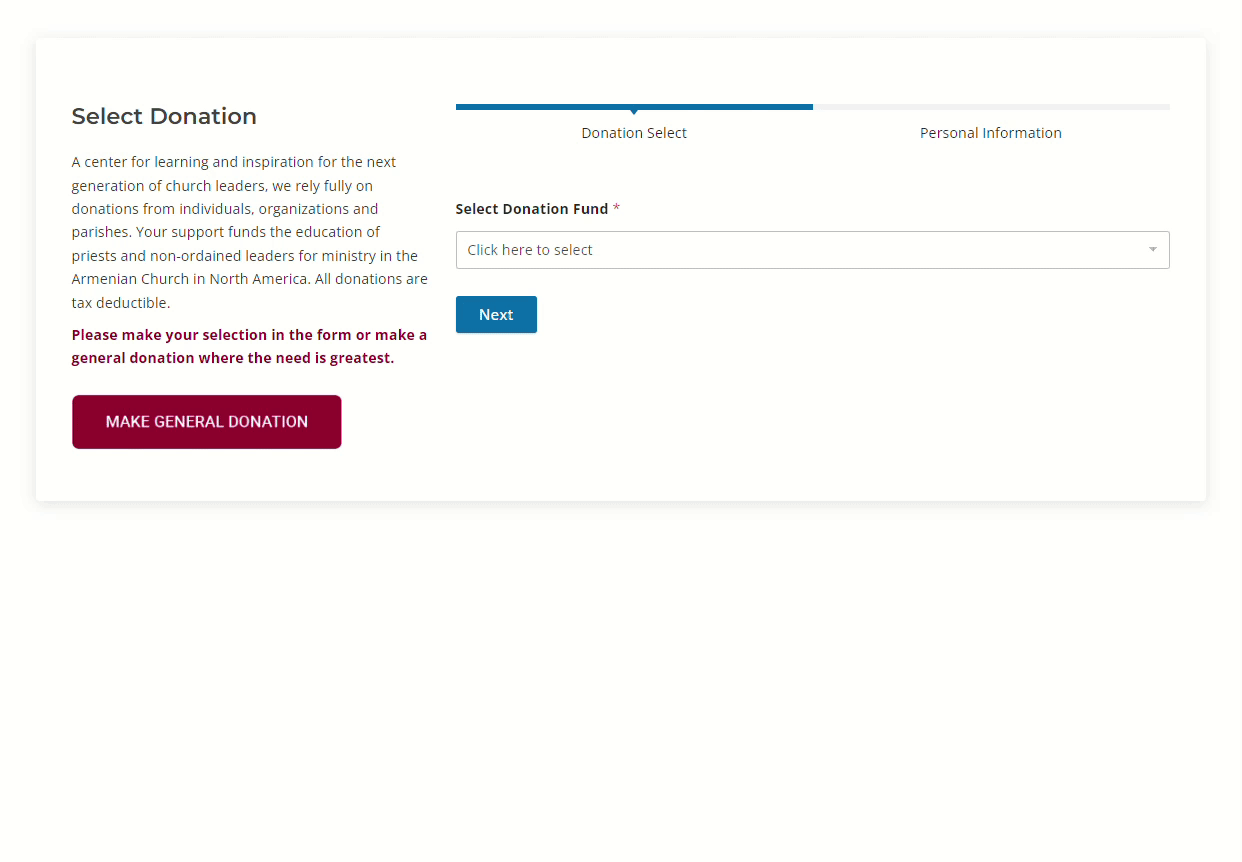
Donors of St. Nersess Armenian Seminary need an easier way to donate. They are limited to single PayPal donations and must mail in or call in for all other donation types.
Additionally, the accountant needs a more efficient way to collect user information associated with PayPal payments, as the current system entails a laborious manual process of data entry.
Additionally, the accountant needs a more efficient way to collect user information associated with PayPal payments, as the current system entails a laborious manual process of data entry.
Description
Role: UX Researcher, Information Architect, Developer
Tools Used: WordPress, WPForms, Sketching
Constraints: Must integrate with PayPal and WordPress
01 Overview & Constraints
St. Nersess needed a digital donation system that collects user CRM and integrates with WordPress and PayPal.
Given these constraints, I researched and discovered that the WPForms extension for WordPress has a paid PayPal plugin that accepts payments–both one-time and recurring. There were many limitations with the software, but it was able accomplish 95% of our needs.
02 User & Client Interviews
Users were having a hard time donating, and the accountant was doing a lot of manual work
I conducted two client interviews, one user interview, and user usage data analysis to determine the needs of the project. There were major frustrations and needs identified on all levels.

1. Accountant: Users info & Payment collection needs to be automated
The accountant was experiencing major frustrations with donations made via the PayPal button not being collecting any information about the user beyond their first and last name, and billing address. She voiced that she often would have to contact the donors by phone or email to retrieve more information about them and manually input them into a database.
2. Communications Director: Needs easy donations for email campaigns.
The communications director voiced the need for a streamlined way to connect marketing campaigns (ie. seasonal donation appeals) to specific form of donations. Currently, when they send out mail or e-mail campaigns, the donor would either need to call in with the donation, mail in a check, or use the generic PayPal button.
3. Users (Donors): Needs donations available online.
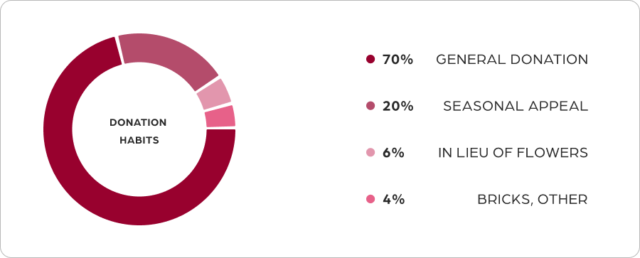
By analyzing the previous year's PayPal report, it was determined that the vast majority (roughly 70%) of donations made to organizations are general one-time donations. The other 30% comprised seasonal appeals and the donors who set up yearly recurring payments. This last grouping of donors, though not many, made up much of the total revenue.
03 Content Analysis
I began by investigating each page to determine the information architecture
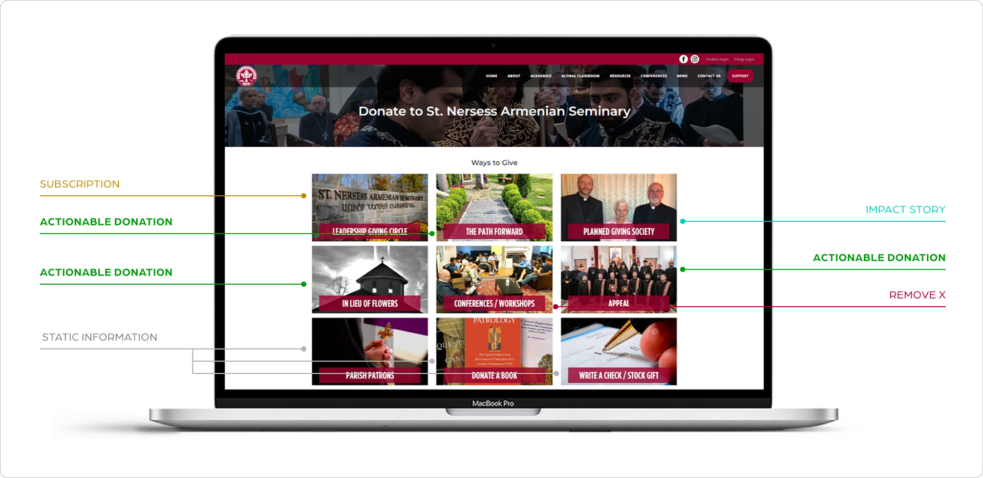
Mapping of the website in its original state.
I discovered that the majority of the donation methods were not actionable.
Actionable Donation: The user can conceivably make a donation.
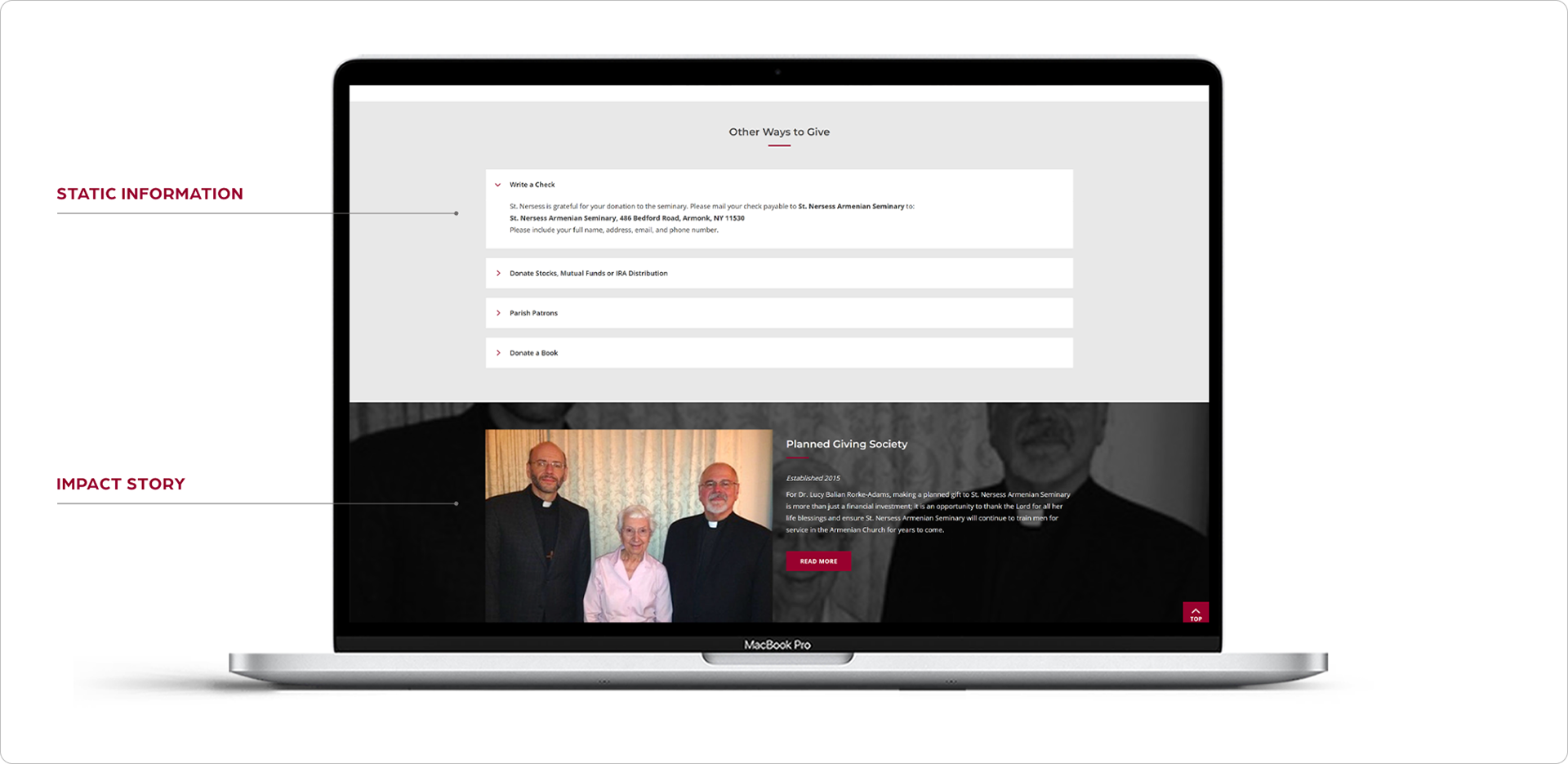
Static Information: The user is provided with information, instructions, and data but no actionable donation.
Subscription: The user can set up a recurring payment, but only through contacting them.
Impact story: The user is shown the history and background of the use of funds.
Non-relevant: Page had no relevance to the rest of the content.
⚠️ Dead Pages (PDFs)
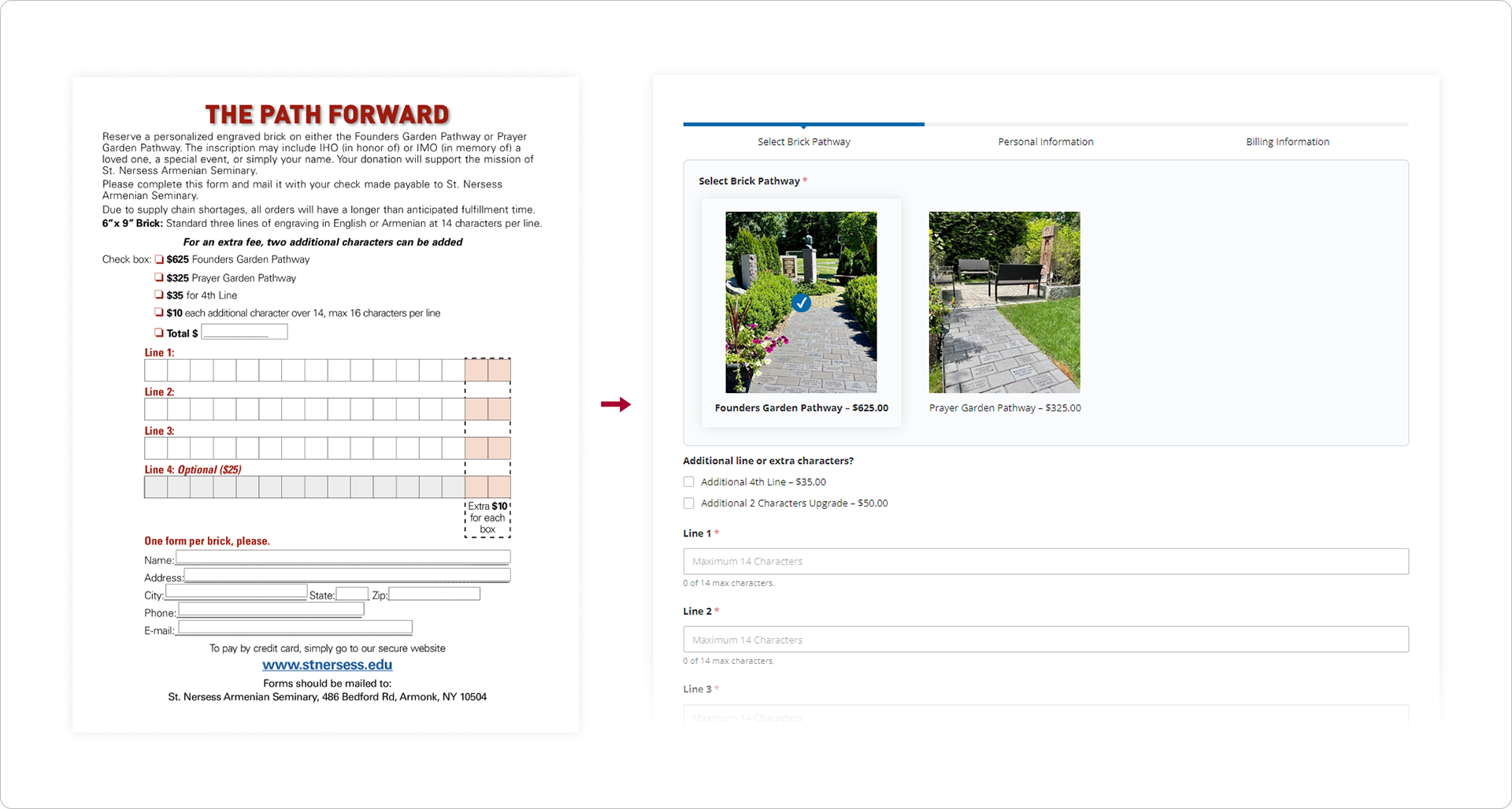
Many pages contained donation instructions only through PDFs that the user had to print and mail in. These PDFs were evaluated for function and later reimplemented into interactive payment systems.
⚠️ Accessibility Issues–the boxes are just pictures!
The grid of boxes are not actually buttons with live text. They are simply composited images. Users on screen readers would have no way of knowing what they are clicking on.
Assuming the user is not visually impaired, the boxes give no indication as to what is contained in them. The 3x3 grid suggests 9 donation types. In reality, there are only 3.
04 Iterative Design Process
I built a MVP that digitized all of the existing forms through a conditional selector.
This addressed the need to make accessible certain donations that were only available through mail.
...and unlocked many functionalities such as digitally recurring payments.

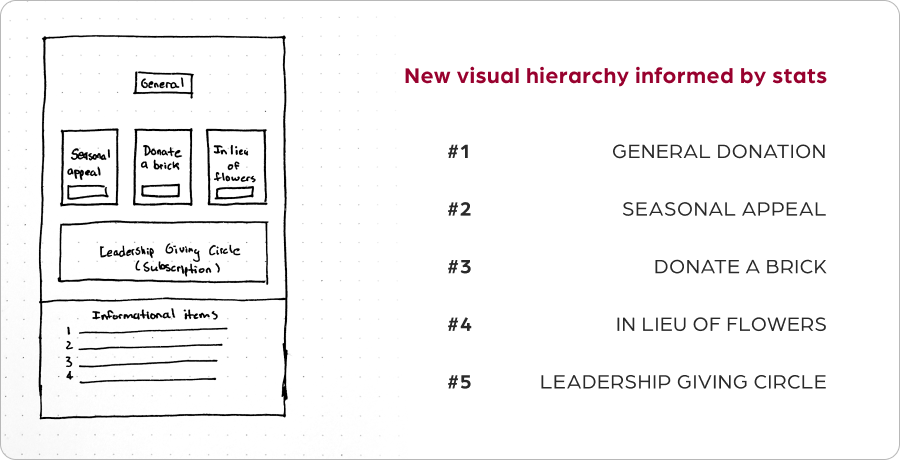
But this creates decision paralysis. I needed to design a hierarchy of choice.
User data from 2022 indicated that the majority of users make simple one-time donations.
05 Second iteration | Sketching
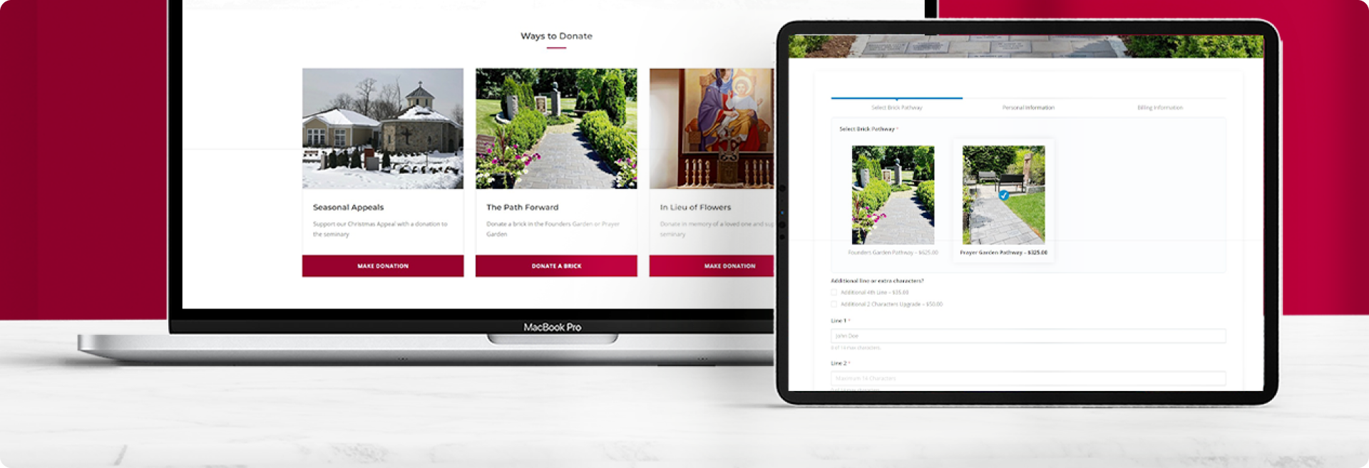
Given the data and user research, I reorganized the information on a landing page.
06 Second iteration | Implementation
...and built the appropriate content blocks to accommodate the information
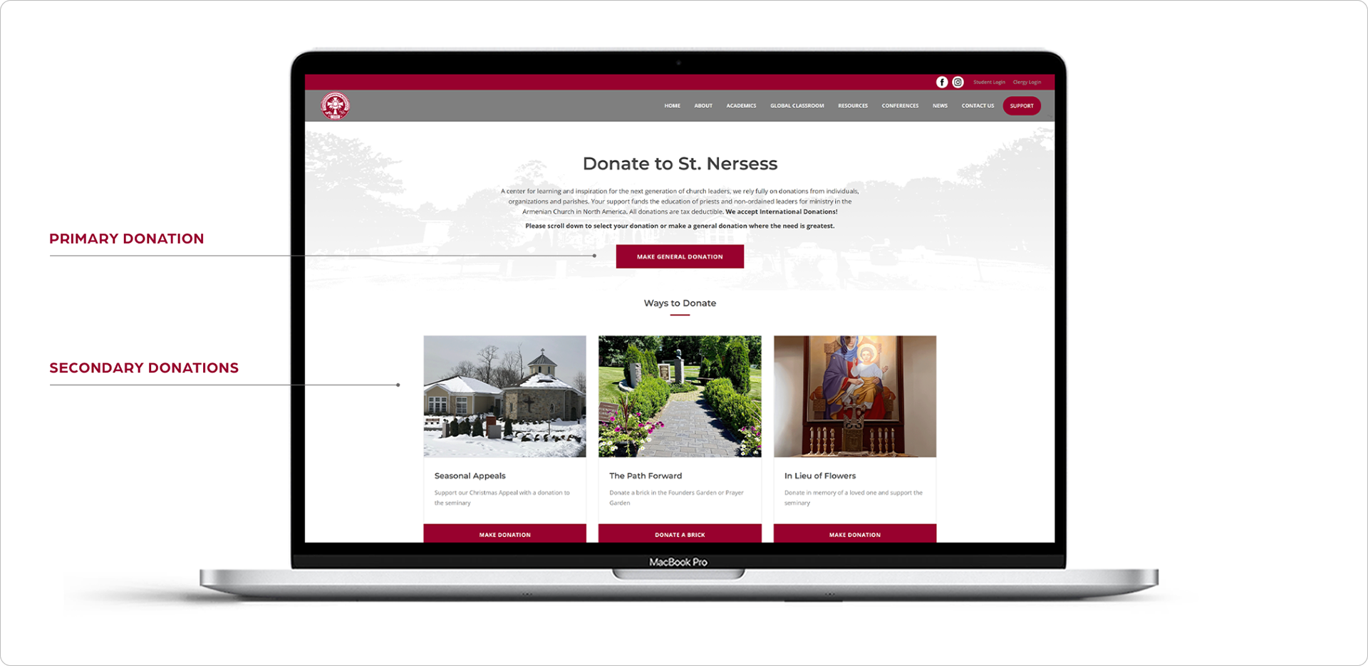
1) First, the "general donations" must be the most accessible choice
2) Secondly, we have a grouping of three donation types (In Lieu of Flowers, The Path Forward, and Seasonal Appeals) that broadly fall under a special donations category.
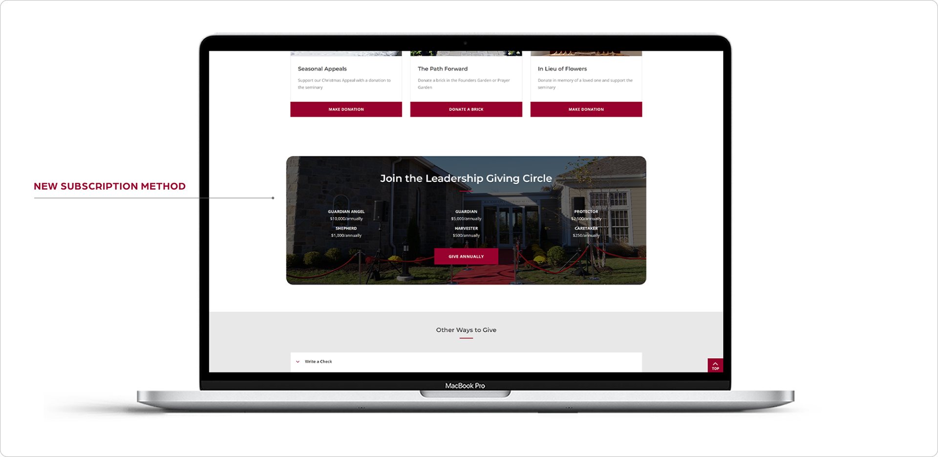
3) "Leadership Giving Circle," which is akin to a subscription system, is separated as its own experience.
4) All other donation information is relocated to an informational section within an accordion menu.
5) Lastly, one of the original pages was an impact story, which is included at the bottom to add a social component to the landing page.
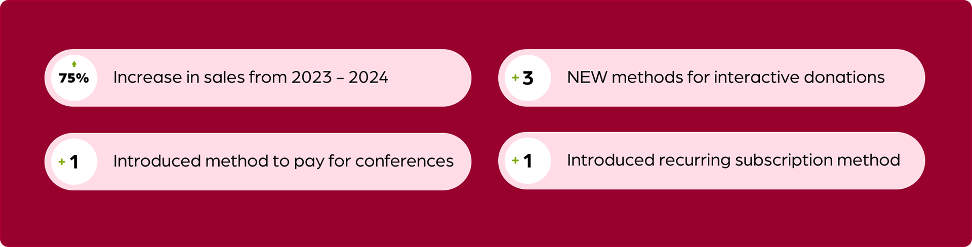
07 Outcomes
The new design yielded nearly a doubling of net donations
Due to the improved accessibility of all the major donation types, the accountant reported a 75% increase in donations from the previous year. Additionally, she reported donations from international audiences the was previously a rarity.