Context
Problem Statement
Locals or visitors to a city want a way to plan an evening based on specials that a restaurant has to offer. They often have specific times in mind they’d like to around, but are frustrated by the process of digging through websites to find offers. Users want an easy way to discover options and plan their day accordingly.
Description
Role: UX Designer, UX Researcher
Tools Used: Figma, FigJam
Constraints: 10 screens minimum
01 Project Overview
Going to restaurants is a very social activity, but an expensive one as well...
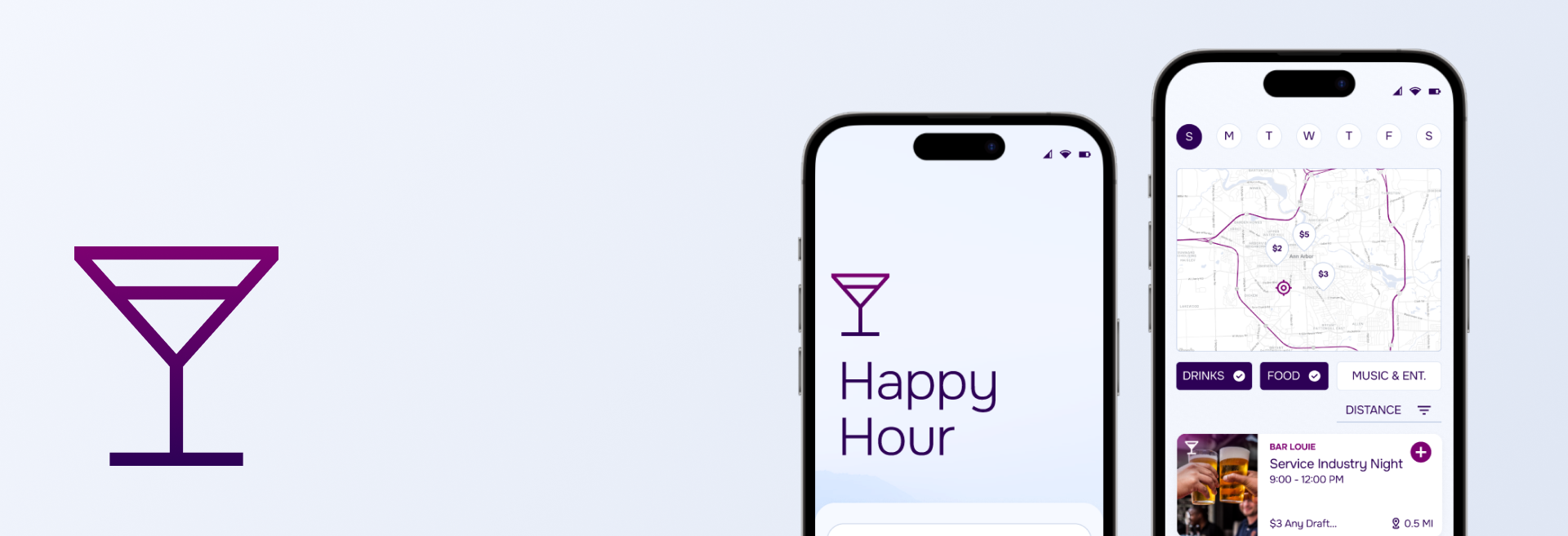
This mobile application addresses the need to discover specials available at restaurants. Additionally, it allows users to plan and share outings, whether they are professional and academic groups, or personal friend groups.

What if there was a way to discover local specials and plan social outings?
02 User Interviews
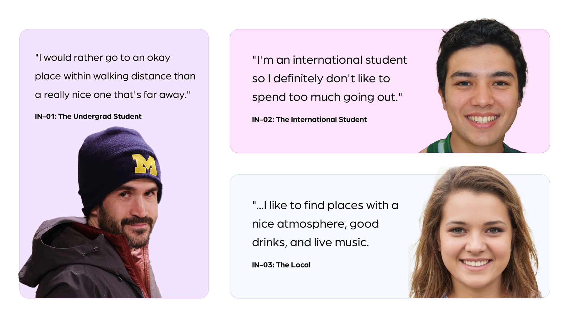
Through user interviews, I discovered that people prioritize distance and atmosphere in addition to cost.
I conducted three user interviews which produced three key findings:
💰 Cost was NOT the only factor evaluated–distance was equally as important.
📅 People want to find interesting events in addition to drink deals.
✨ Some users want somewhere safe with a good vibe over somewhere cheap.
📅 People want to find interesting events in addition to drink deals.
✨ Some users want somewhere safe with a good vibe over somewhere cheap.
03 User Flow and Site Map
Developing a flow that minimizes interactions, and maximizes glanceability of key information
As I was developing user flows, I was trying to consider the minimal necessary interactions to be able to browse through a set of listings and add one to the planner. I thought it was necessary to keep the page-to-page interactions minimal in order to keep the focus on discovering local deals.
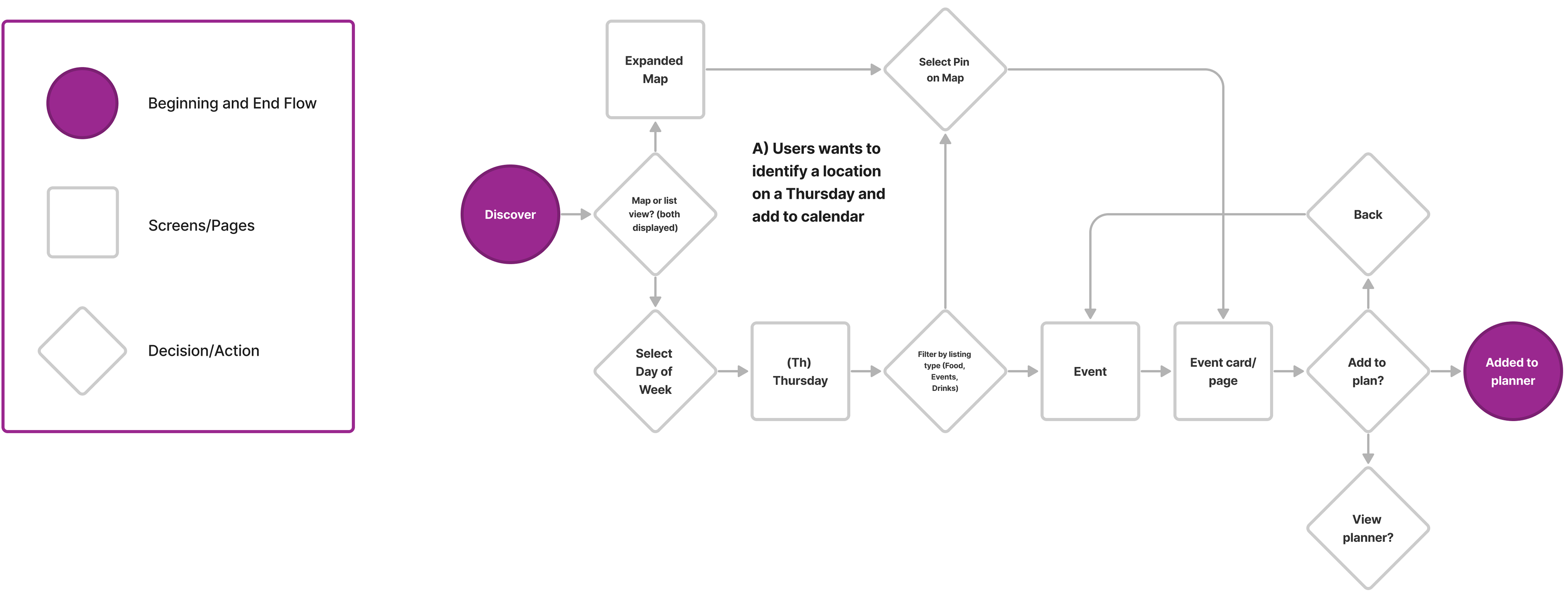
User flow for adding event to planner

Site Map
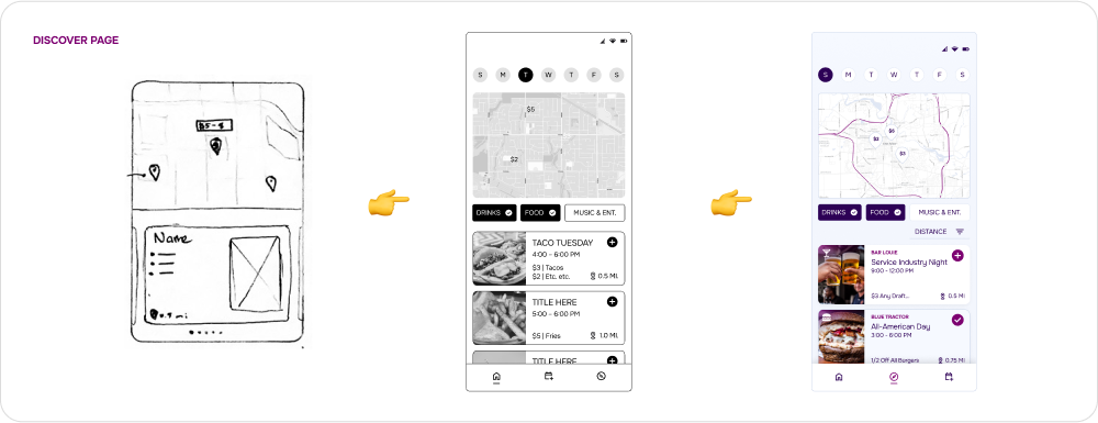
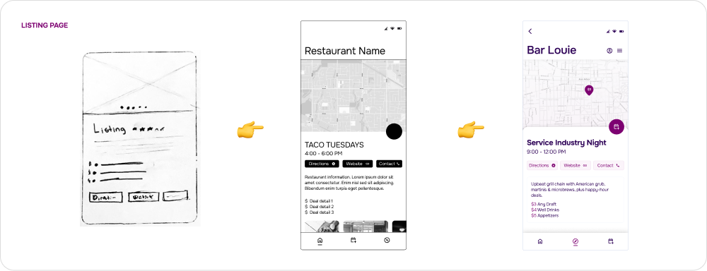
04 Paper Sketching
Ideating feature ideas with an open mind
I gave myself 25 minutes to ideate through ten screens with the user flow in mind. Through this process, I discovered multiple ways to organize the same information, such as the listings on the discover page. In the final design, I merged multiple ideas into on screen.

05 Wireframes, High-Fidelity Designs
From concept 👉 high-fidelity design
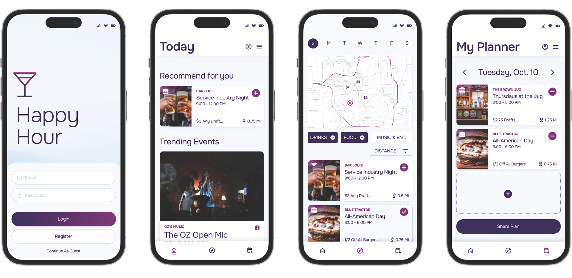
Following the sketches, I created black and white wireframes in Figma with the primary goal of organizing the key information without overwhelming the user.
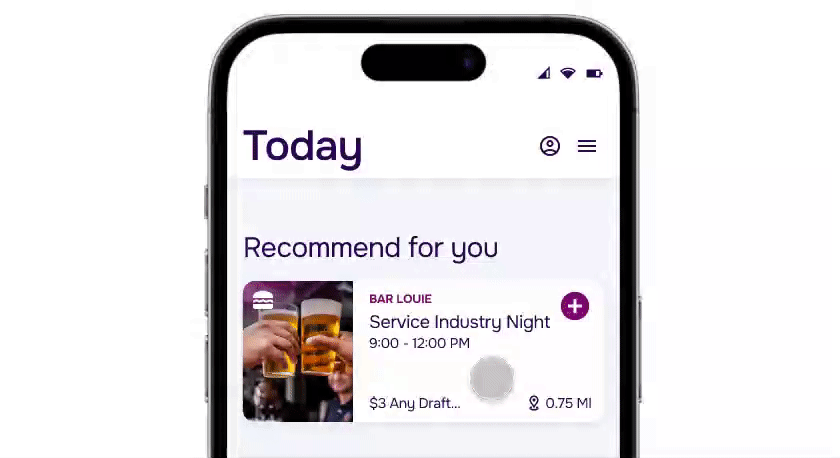
For instance, the restaurant cards that repeat throughout the UI need to incorporate distance, costs, listing name, and restaurant name.

06 Prototyping Interactions
Bringing life to the experience through interactions
With the foundation set through the wireframes and heuristic evaluations, my goal with prototyping interactions in Figma was bringing to life the experience of browsing through options, adding and event, and sharing it with a group.
Key Decision #1: Organizing Listings by Distance and Cost
Interviews revealed that cost was not the only concern for users.
Listings are organized linearly, with an option to filter by distance, cost, or category.
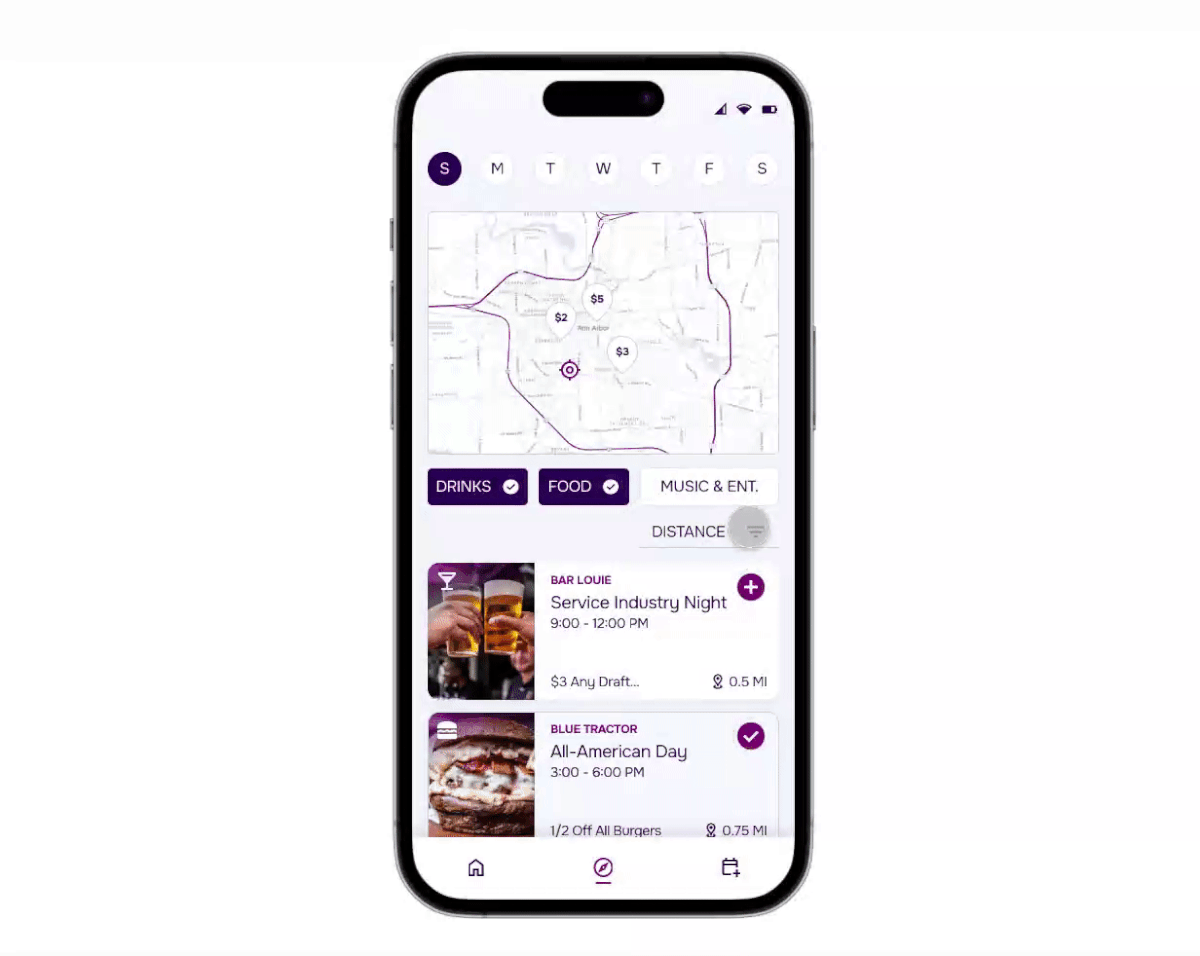
Key Decision #2: Preview Access to Deals
To make the browsing experience effective, lots of key information must be accessible at a glance, including restaurant information, distance, and deal listing name.
In order to also include a preview of the deals, I used an "on hold" interaction that expands the restaurant card and displays deals at a glance.
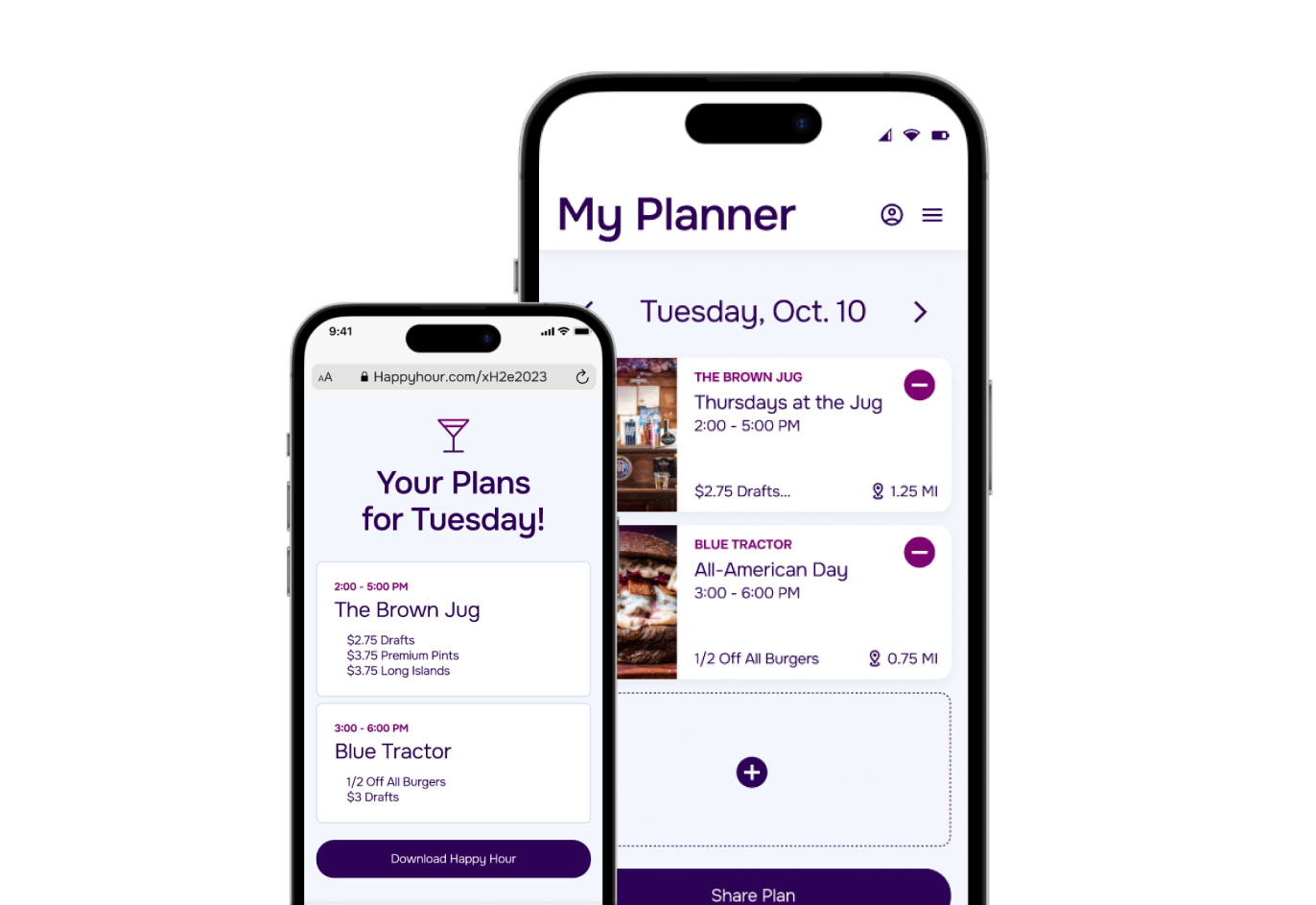
Key Decision #3: Sharable Plans
Users are given the ability to share an itinerary with others, whether they have the application installed or not.
The application generates an expiring link that can be sent to friends.