In-car displays are becoming increasingly complicated.
Displays are getting larger. Touch targets are getting smaller.
Frankly, it feels like cars are being outfitted with large touch tablets. This cannot be good for safety.
💡I wanted to explore ways to reduce the number of precise taps drivers have to make on the center screen.

While driving, interactions with digital screens should not exceed 2-second gaze times

I began to explore the mental model of 3-finger swipe gestures on laptops
🤔 Why would this work? For two key reasons
- Car applications have modes: media --> FM, AM, AUX, Bluetooth. Navigation --> resting screen, navigation, search.
- Drivers don't use many apps: mainly media, navigation, HVAC
What if we put the main applications on the X-axis and the modes on the y-axis?

I put the concept to the test with a simple prototype in Figma
This proof of concept helped me identify a crucial opportunity.
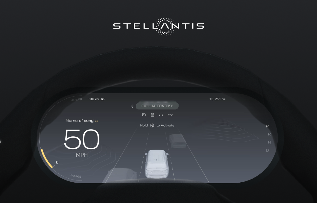
Since the left of the screen is the most accessible part for drivers, we can utilize that space to minimize the previous application controls to widget form. Since the right edge is too far for interaction, it displays glanceable info about the next widget.
- Left edge: interactive controls
- Right edge: glanceable information

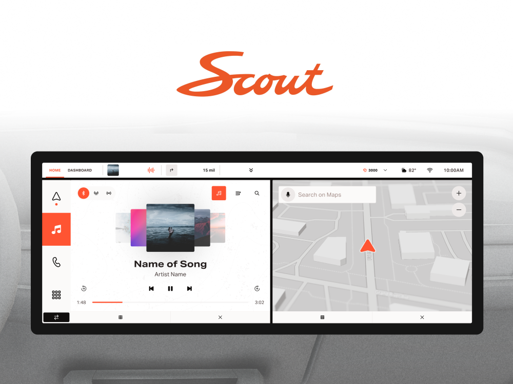
With the prototype working, I componentized each "app" into full screen and widget forms.
The widget component takes the bare minimum controls of the full screen version and organizes them on the left with auto layout.

And organized them in an intuitive flow.

Achieving the final product