Figma Presentation Summary
The follow overview was presented to the General Motors (GM) product team.


Design the in-car experience for a vehicle in the luxury segment.
General Motors (GM) challenged students of SI 594 to design the in-car experience for a luxury vehicle, including a mobile app.


"These users care about comfort, features, and convenience above all else. Often new features and technology can be found in this segment vehicles as a result." (Design Brief, GM)
Associated Design Feature
In-Vehicle Theme With a set of users that cares about how a car looks, feels, and acts inside, there is an opportunity to create a feature that changes the in-car experience from screen graphics to lights to motion to even sound

How might we create an experience for a luxury vehicle that delivers “newness” without compromising on safety and usability on the road?
Luxury consumers come to expect more from their vehicles: comfort, convenience, and amenities—the latest and greatest. But this is often at the expense of usability and safety. We designed something that achieves both.


Key Decision #1: Bento Box UI
- Bento Box design currently at height of popularity in design trends
- Prioritizes compartmentalization, efficiency, and aesthetic presentation.
- Aesthetic & efficient for drivers maintaining focus on the road

Important information is modular and easy to find


Key Decision #2: Layered Design & Glassmorphism
- Visual Hierarchy: adds sense of depth and dimension for user, intuitively orienting their position in the interface.
- Multitasking aid: several layers of information can be stacked with minimal cognitive load.


Key Decision #3: Widgetized App Overlays
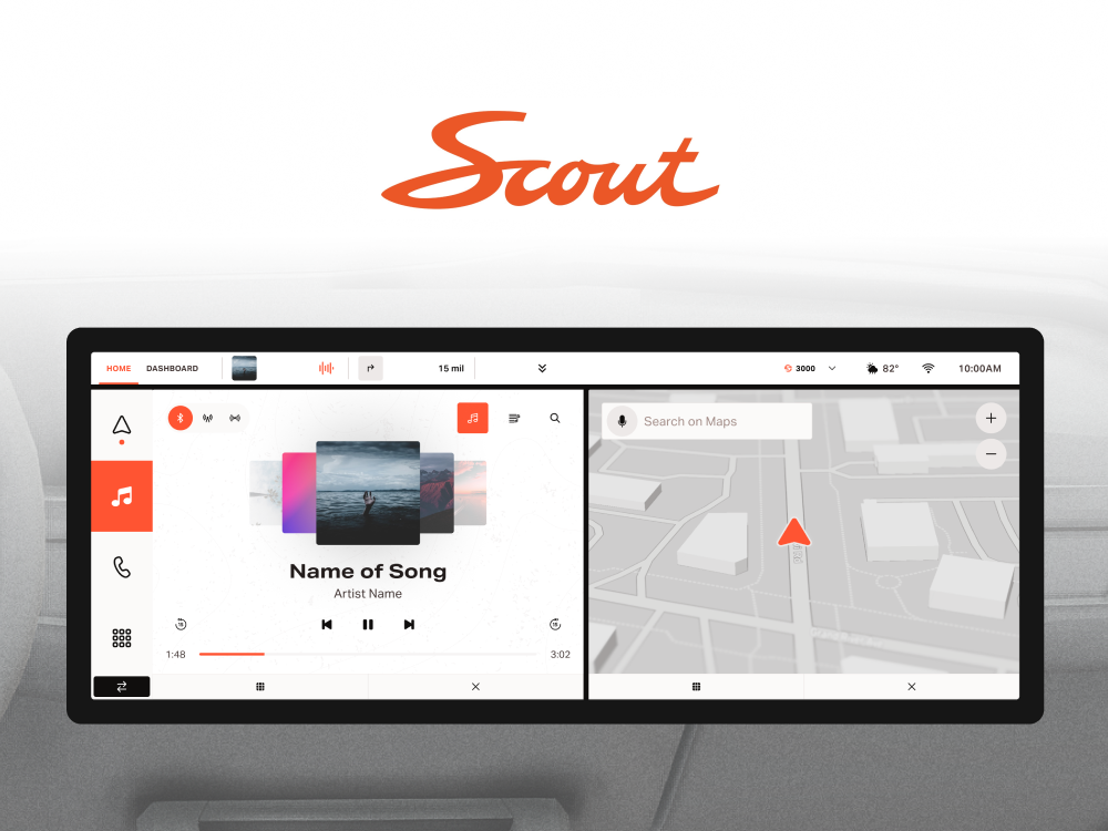
Competitive analysis uncovered that the majority of luxury vehicles utilize wide format displays. We can take advantage of this extra horizontal screen space to stack applications for multitasking.


Key Decision #4: "Caraoke" Mode
- Passenger experience for luxury vehicles just as important as driver experience
- "Caraoke" mode adds social value to the in-car experience, whether for friends or for premium transportation services.
- UI accent colors become music visualizer
- Third screen displays lyrics


Decision #5: Persistent 3D HVAC and Vehicle Controls
The use of 3D visualizations can help the driver get an intuitive sense of what they are modifying.
I also decided that HVAC must take it's own space in the first layer since these settings are so commonly accessed.


A fully interactive atomic design system ready for development
Utilizing the latest feature offerings, a built a design system consisting of primitives, tokens, and components such that the prototypes can be using for user testing.


